HOARD
Hoard isn’t “lifecycle marketing.” It’s war. Getting customers is easy—anyone with a budget can do it. Keeping them? That’s the campaign. Every customer is a piece on the map. Once you’ve got them in play, you need to hold your ground.
-
Retention looks simple on paper: automate, repeat, profit. In practice, it’s a knife fight. Most brands lose more customers than they keep because they treat retention like housekeeping, not like strategy. Hoard needed to claim its place as the general in that fight—the one who knows it takes patience, discipline, and intuition to keep the line intact.
-
Lifecycle marketing is a battlefield. The terrain shifts. Opponents adapt. Customers move like pieces in a long campaign. That’s why Hoard was built around the principle that retention isn’t reactionary—it’s deliberate warfare. Strategy comes first, intuition follows, automation serves. We didn’t frame Hoard as another tool. We framed it as the one holding the map.
-
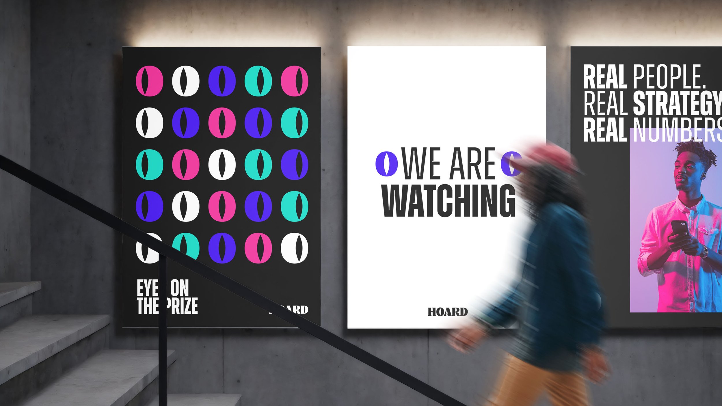
Naming: “Hoard” isn’t clever—it’s inevitable. To hoard is to guard, to stockpile, to refuse to lose ground. The name became the philosophy.
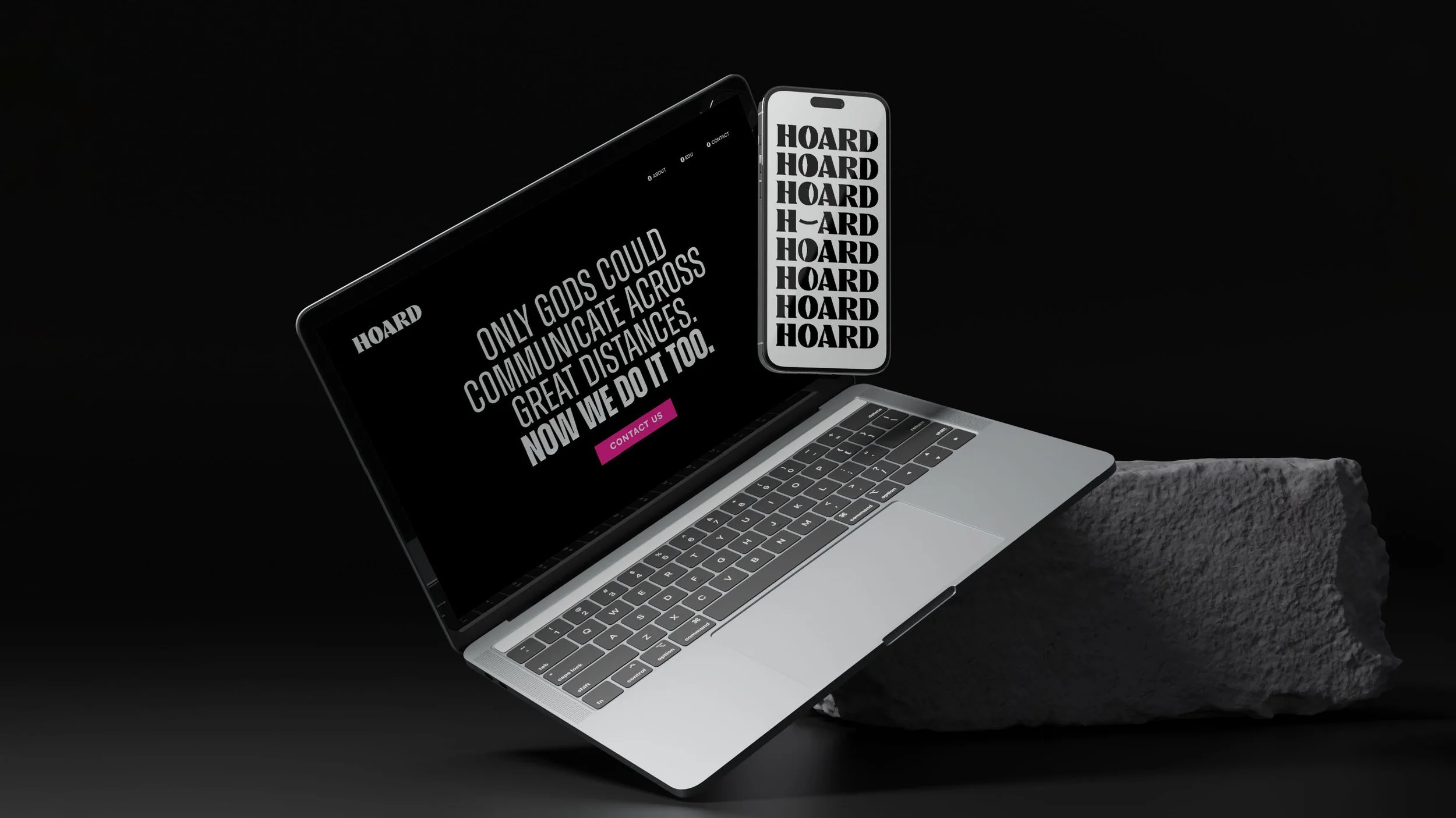
Visual Identity: A system built on contrast and confidence. Oversized typography. Electric gradients. Iconography that feels more like symbols than decoration. Every asset designed to grab attention and hold it.
Verbal Identity: Sharp, declarative, irreverent. No marketing gloss, no filler. Copy lands like a statement you can’t ignore: “Only gods could communicate across great distances. Now we do it too.”
System: A complete brand framework—strategy, design, messaging—that turns lifecycle marketing from “customer management” into a cultural campaign.
-
Hoard doesn’t blend into the background of SaaS sameness. It launches as a brand that’s impossible to scroll past: bold, memorable, and strategically positioned as the one agency that makes retention feel as important as it is.