The Bomb Co.

Blender Bombs aren’t “health food.” They’re survival tools for the modern schedule. One step above trail mix, one step below meal prep. The Bomb Co. makes nutrition fit into a culture that glorifies being too busy to eat.

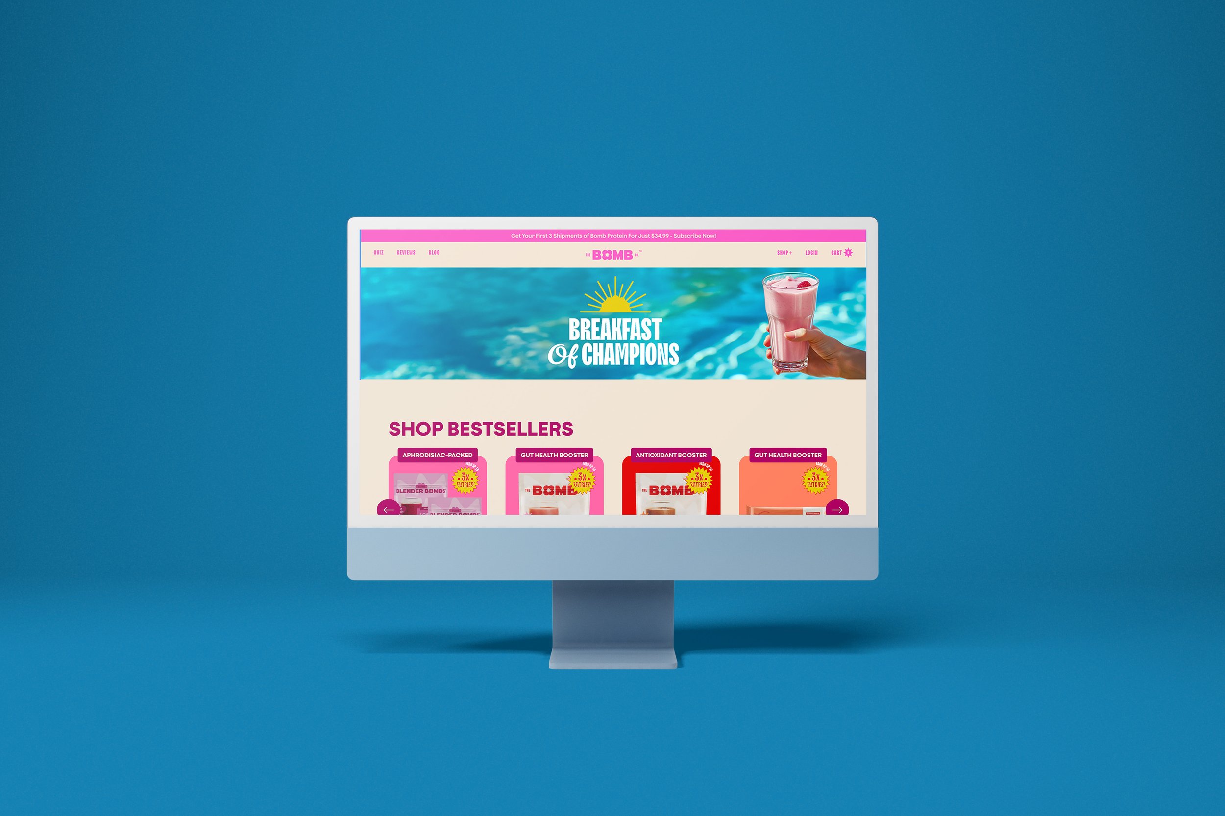
  • The wellness aisle is crowded with brands preaching the same sermon: clean, green, pure, natural. Every label looks like a yoga retreat with better typography. The challenge wasn’t just to differentiate; it was to make health relevant to people who aren’t planning their day around chia seeds.

  • We didn’t sell macros or vitamins. We sold states of being. Each of the eight campaigns was built from archetypal psychology — joy, strength, freedom, intimacy — the emotional hooks that drive why people actually choose wellness. Instead of dropping another pastel Instagram flat lay, The Bomb Co. leaned into storytelling that felt more like Nike than Whole Foods.

    • Archetype Campaigns – Each one mapped to a cultural emotion, not a nutrient fact.

    • Visual Language – Bold, vibrant, layered with subconscious cues so the campaigns felt lived-in, not “lifestyle.”

    • Narrative Direction – Superfoods reframed as cultural shorthand: not “good for you,” but “this is how people like you live.”

  • This wasn’t just a campaign—it was a year-long choreography. Eight distinct drops, each one wired to an emotional trigger: desire, energy, joy, discipline, self-love, connection, resilience, indulgence. Instead of selling smoothies, we sold feelings you could drink.

    The work stretched across the spectrum: archetype mapping, campaign naming, color psychology, and art direction that knew when to wink and when to flex. From pink-tiled sets that looked like a Wes Anderson fever dream to “Love Bomb” visuals that blurred the line between Valentine’s Day and pop art irony—we built a modular campaign system that kept people watching, clicking, and yes—blending.

  • The Bomb Co. stopped being “that smoothie ball brand” and became a lifestyle language. Customers didn’t just buy Blender Bombs; they bought into a story—one that felt playful, seductive, and slightly dangerous (in the way only eating healthy at 11pm can feel dangerous).

    Engagement spiked because we didn’t preach health, we performed it. Each campaign became a touchstone for the community: a moodboard, a joke, a flex. The brand earned not just sales but loyalty—the kind that reposts, recreates, and reframes your ads for free. In short: we made wellness cool without making it self-serious.

A woman in a pink kitchen holding a box of Bomb Bomba with an expression of surprise. The kitchen is decorated in shades of pink with shelves, vases, and utensils, and has a window showing a colorful garden outside.
Two women in yellow raincoats are standing in a kitchen, making a smoothie in a blender. The woman on the left is smiling broadly, while the woman on the right has a surprised expression. They are wearing hooded rain jackets, and splashes of smoothie are seen mid-air. There is a packet labeled "The BOMB" on the counter.
Graphic design with red text reading "LOVE BOMB" and a cherry with a heart-shaped explosion above it.
Hand holding a plant-based, nutrient-rich snack ball above a labeled package of The OG Blender Bomb, with large blue text that says 'Best Way to Start the Day' and notes indicating the snack contains 12 nutritious superfoods and 9 essential amino acids.
Colorful background with a white square in the center containing the text 'Fuel your mornings with a bang!' in pink and blue font.
A collage of nine social media posts and images related to Love Bomb, featuring text, food, and branding elements, with a smartphone displaying the Love Bomb Instagram page.
A milkshake topped with whipped cream and a strawberry, surrounded by rose petals, with text reading 'Made with Love' and labels for frozen yogurt, blueberry, strawberry, and blender bomb.
A laptop displaying an online store for health supplements and superfood products, with two floating screens showing product pages, surrounded by a plain gray background.
Flat lay of various colorful marketing cards and an Instagram feed on a smartphone, featuring beverage images, promotional messages, and branding for the BOMB Co, against a red background.
Pink strawberry smoothie in a glass with a pink spoon, surrounded by strawberries, raspberries, and blueberries on blue plates and table.
A computer monitor displays a colorful website for a health supplement brand, featuring a poolside background with a hand holding a pink smoothie and a section titled 'Breakfast of Champions' along with products labeled 'Shop Bestsellers.'
Close-up of a hand holding a small, round, breaded breakfast food item against a blue background with repeated text 'BREAKFAST OF CHAMPIONS'.
A green kiwi smoothie with a striped straw and kiwi slices on the glass, placed on a yellow surface with a yellow background. The image includes pink and white text saying 'Start your day the bomb way!' and a sun icon.
A person's hand holding a breaded, fried food item over a pink background. In the foreground, there is a glass of pink smoothie and a white card with pink stars and a customer review about smoothies.
The words 'B' and 'MB' in large black font on a white background.